Cannes Lions 2019
illustration for advertising
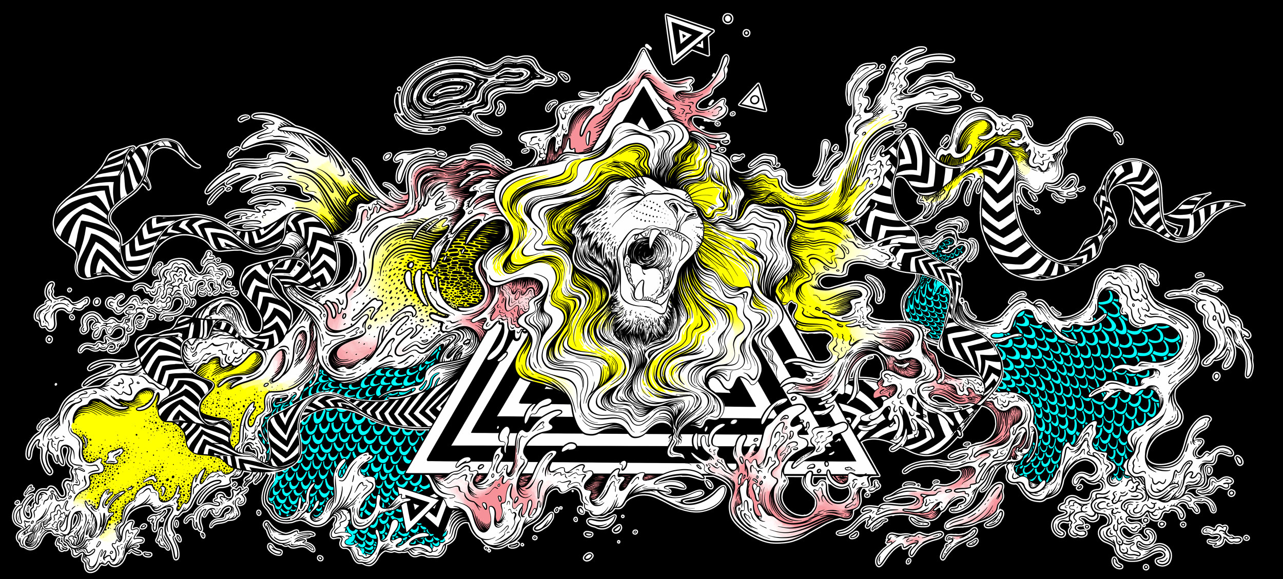
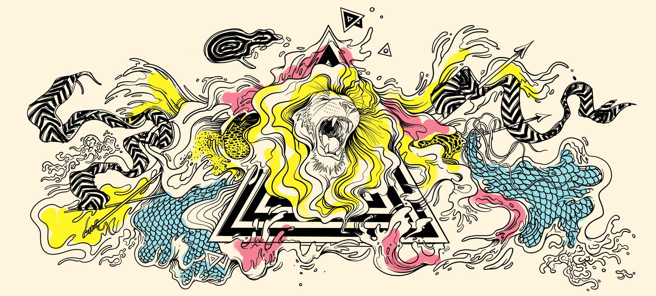
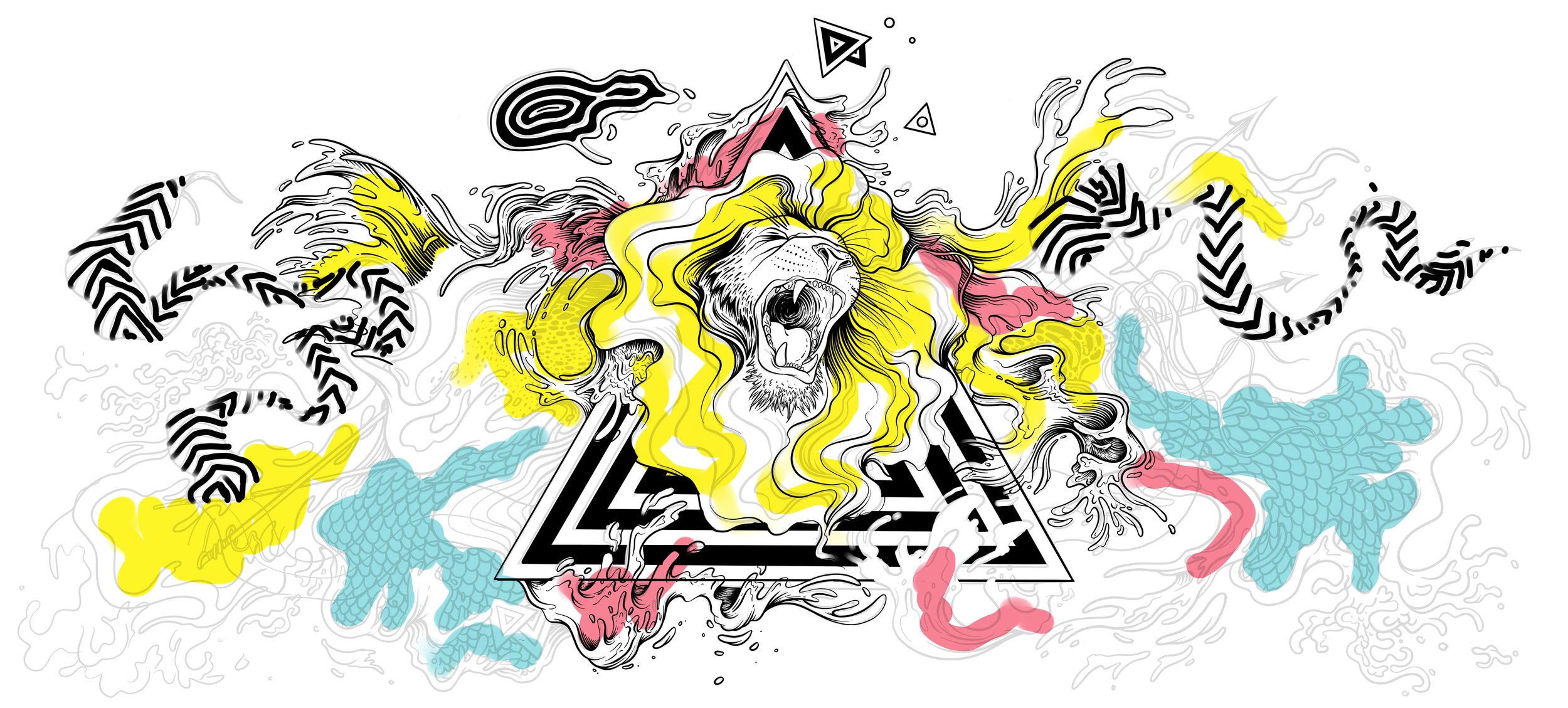
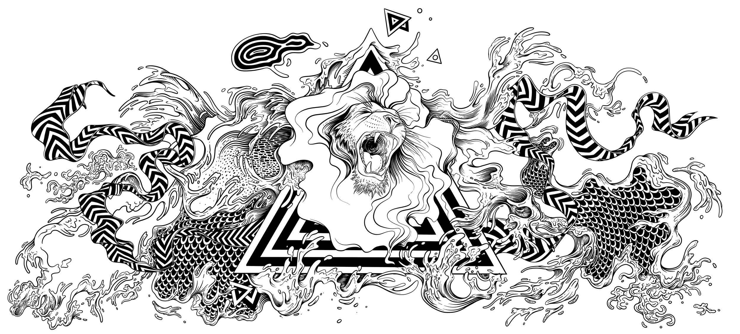
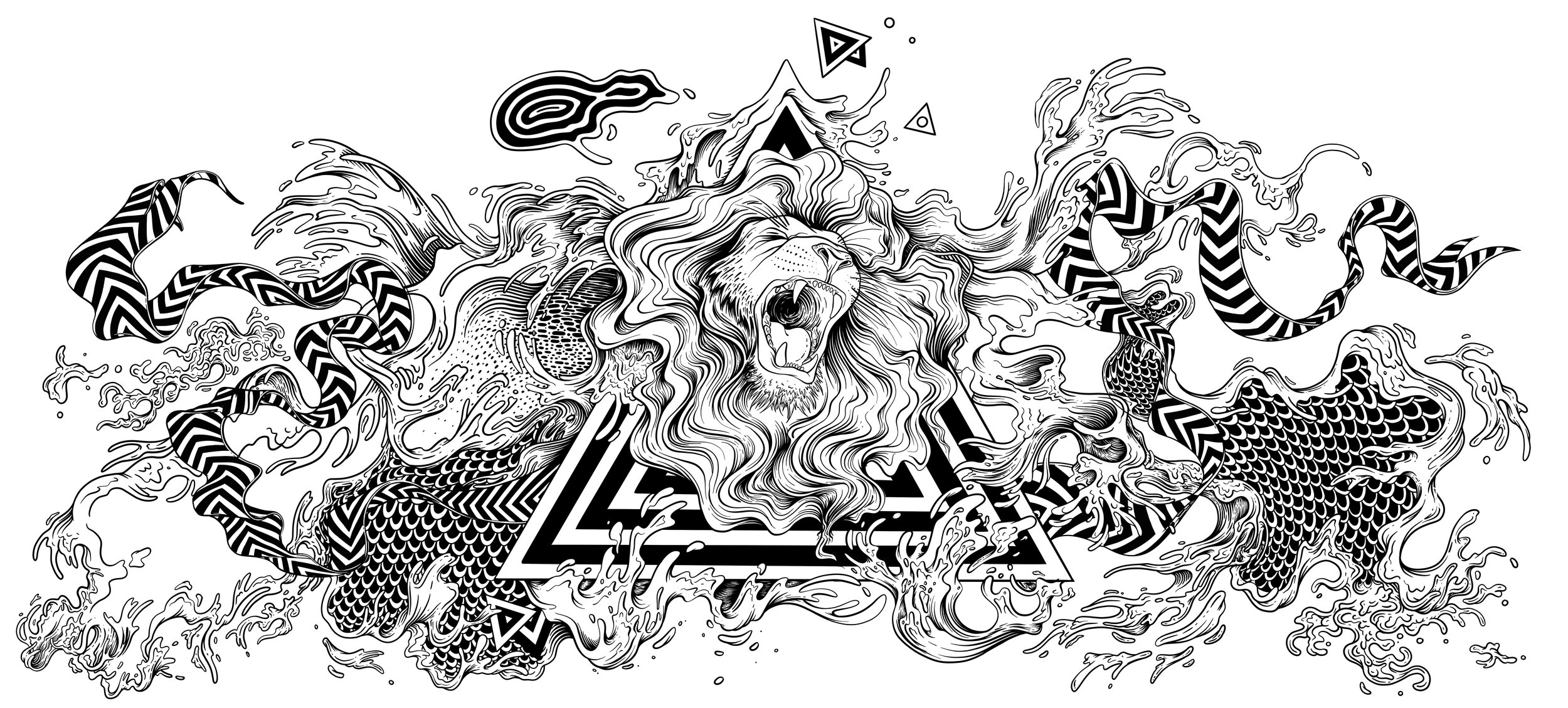
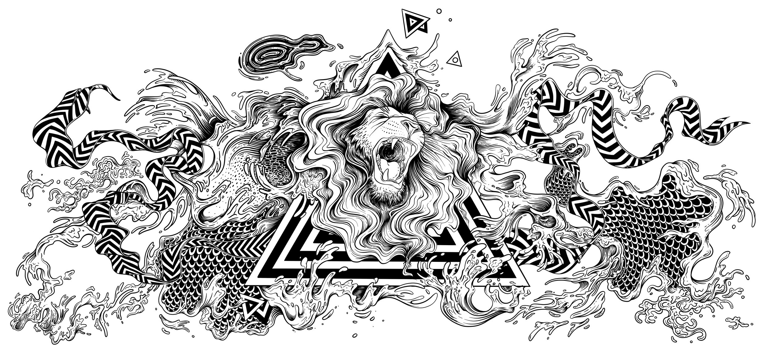
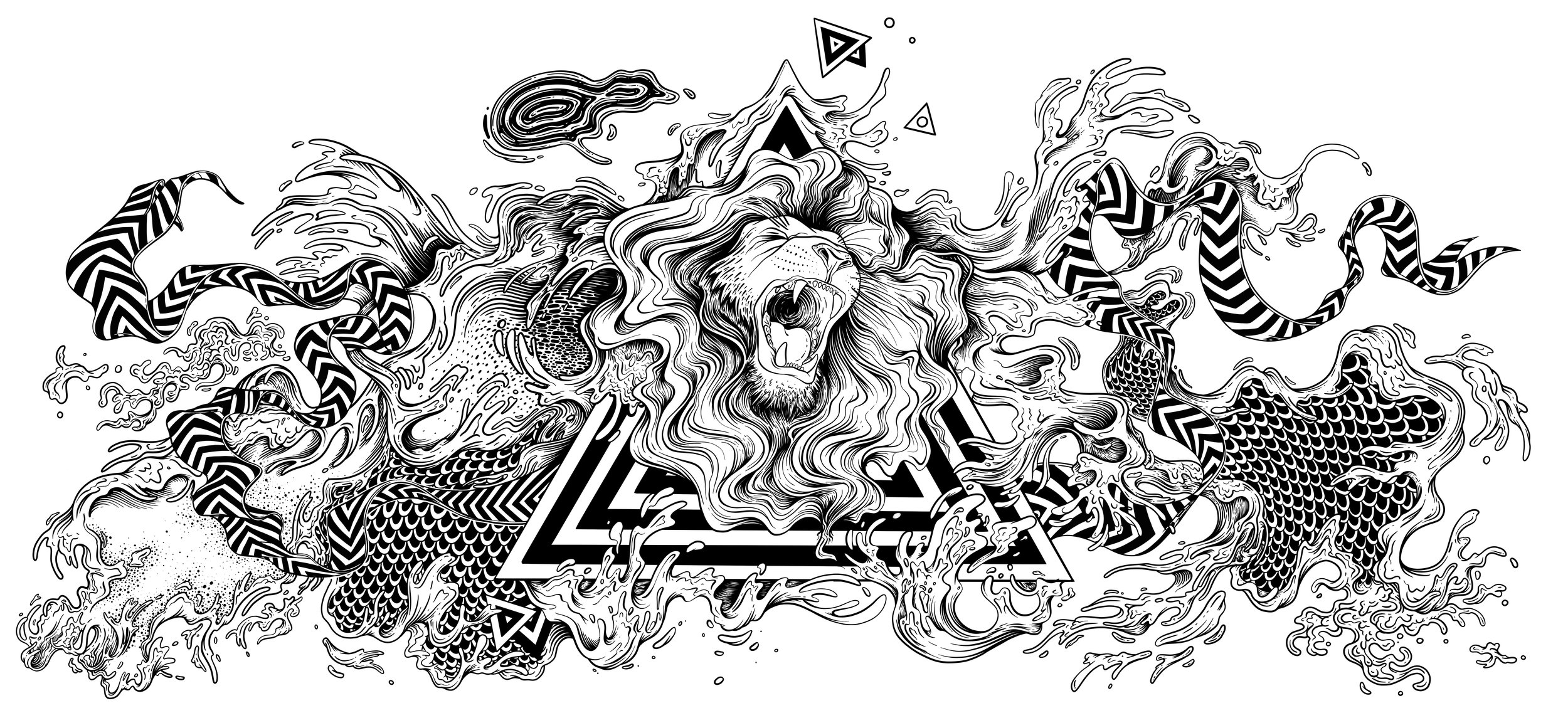
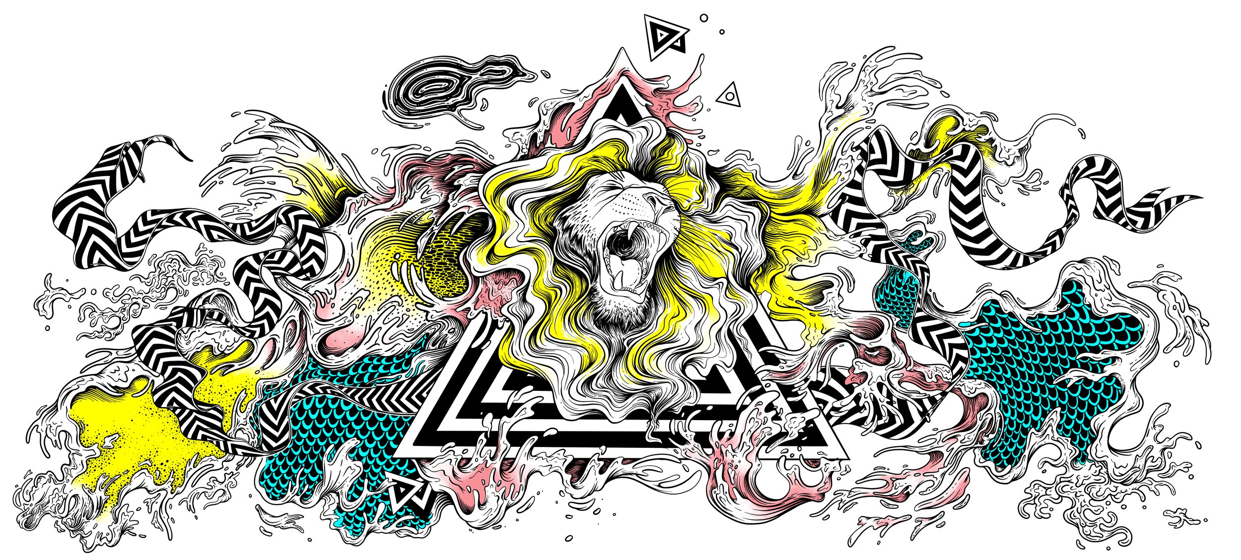
In 2019 Adobe asked me to create an illustration to promote their presence at the Cannes Lions advertising awards festival in South France.
The brief was simple enough - create something featuring a lion.
Sketches
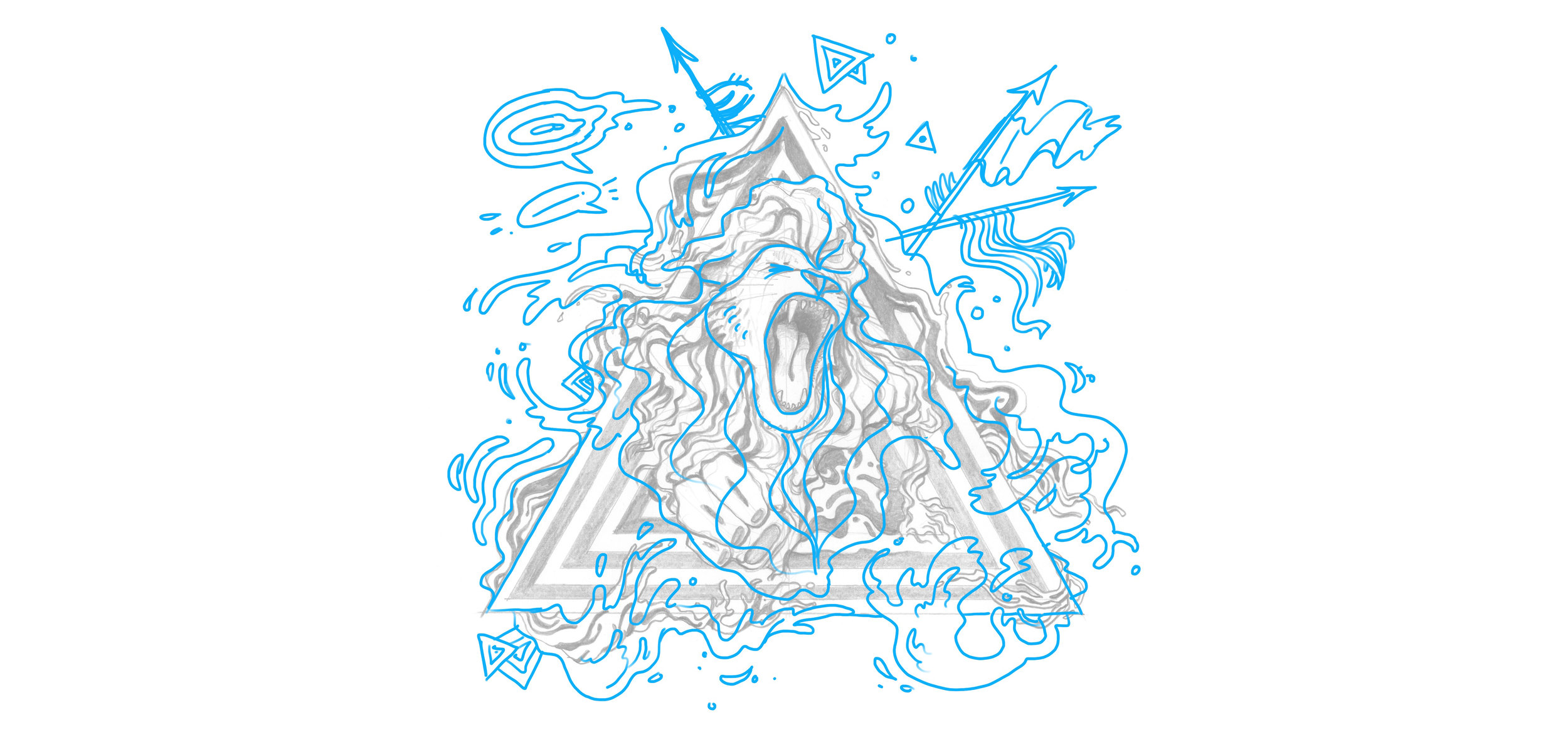
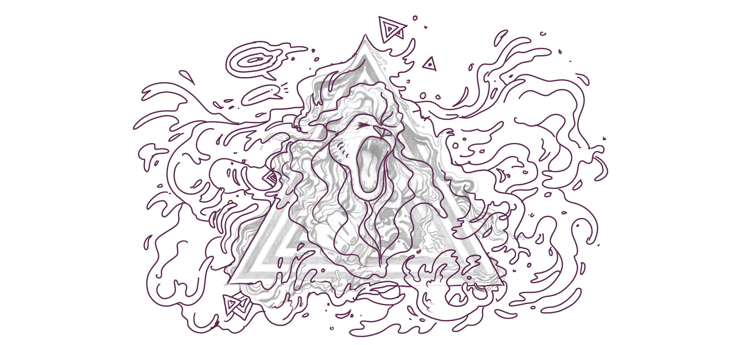
In the sketch stage I was thinking about two main directions - a cuter, more 00s version inspired by artists like Kerby Rosanes, or a more dynamic option with less elements, but more movement. We chose the second one with the ask to go way more horizontal in the format.
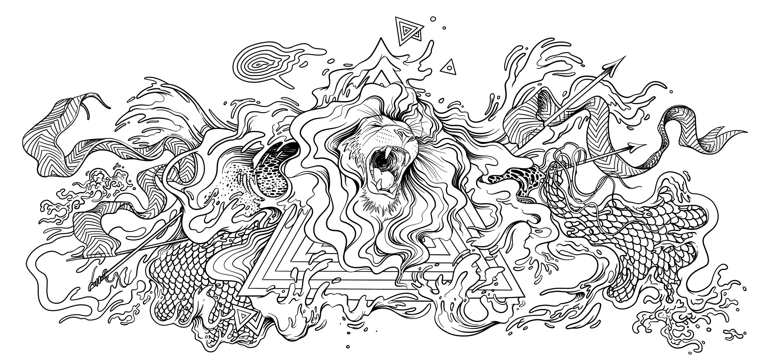
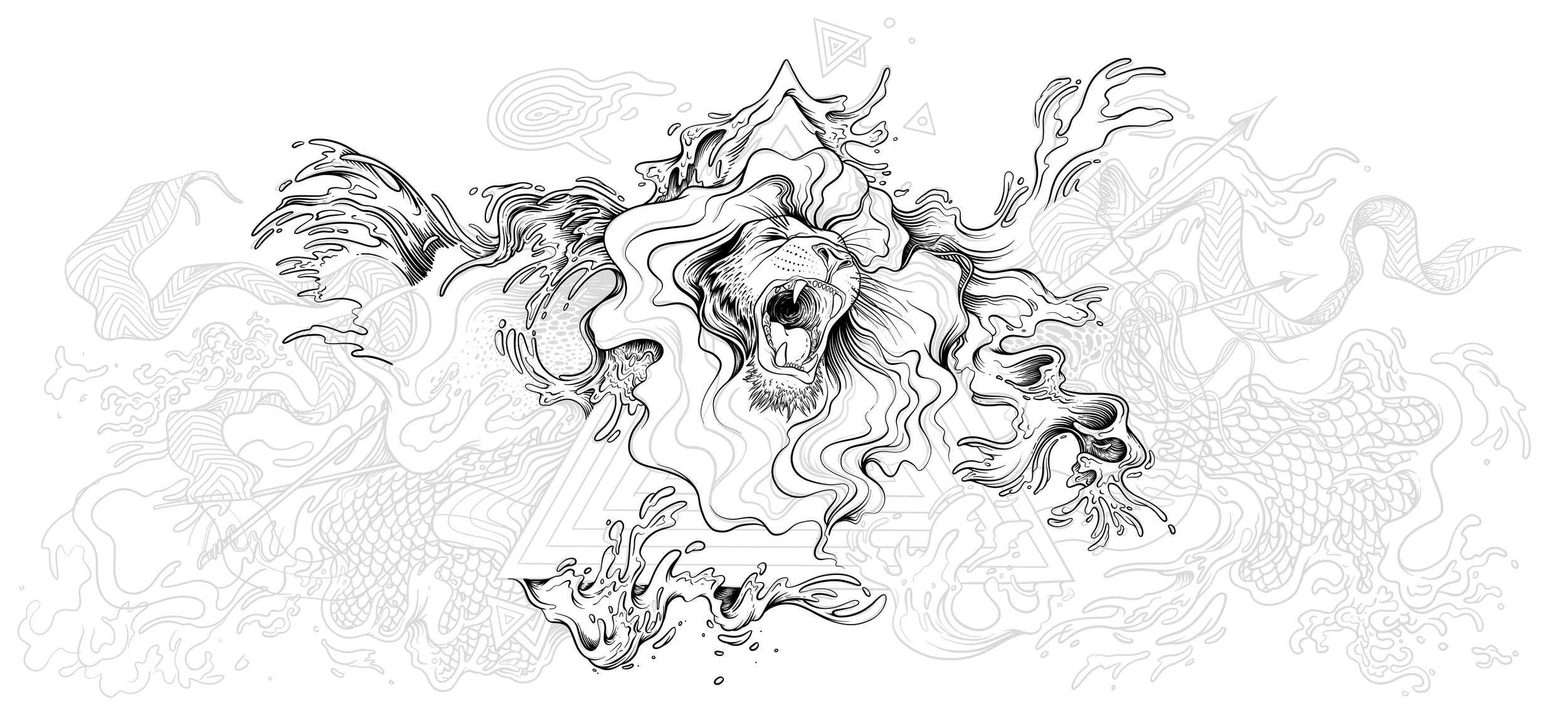
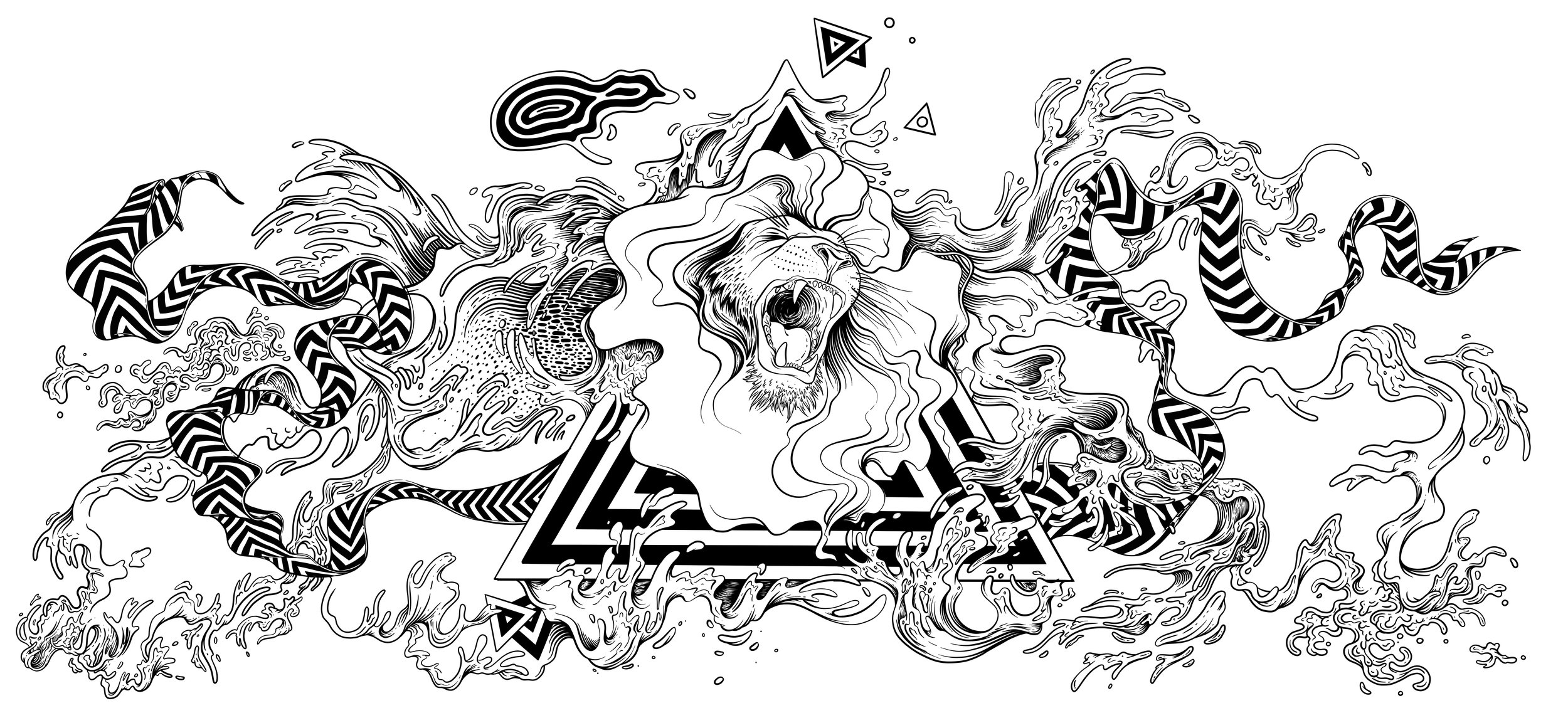
After the concept has been nailed I like to proceed with very very rough sketches to establish composition. Then I make one more finished sketch where everything is laid out nice and neat (I notice that the cleaner my final sketch the better my final illustration) and start inking.
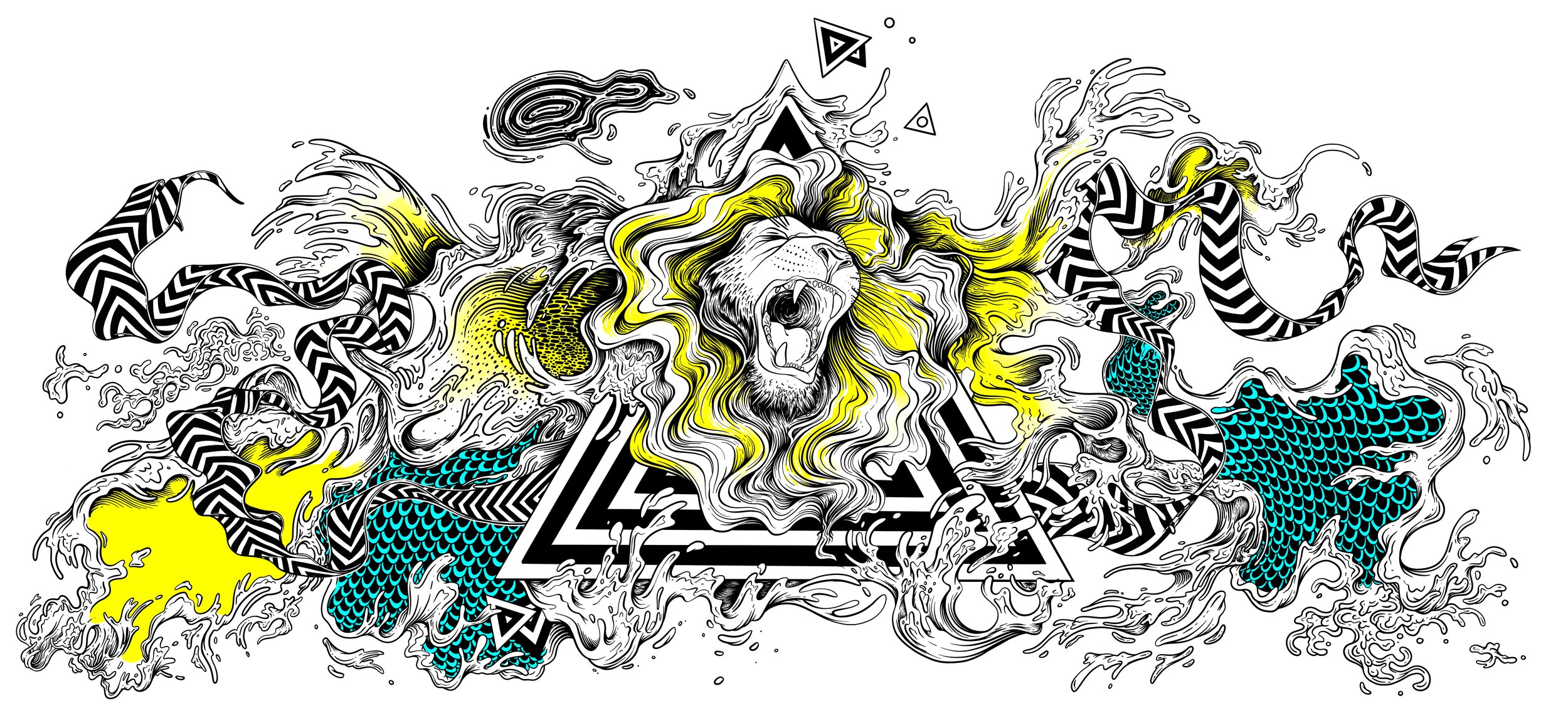
Color Options
Some of the color options. Which one is your favorite?


